Friday 19 April 2013
Monday 8 April 2013
Evaluation
For
my A2 advanced portfolio I chose to create a promotion package for the release
of a video, including a music promo video combined with a cover for its release
as part of a digipak and a magazine advertisement. I chose to create a video to
the song Tied
Together With a Smile – Taylor
Swift following the predominant country genre. Aspects of pop are apparent in
the artists work and in areas of her lyrical choices; however I chose to focus
both the performance and narrative on this unique country genre through
alternate mise-en-scene. Towards the end of my video construction I planned the
production my digipak and magazine advertisement in order to promote my product.
In order to accurately evaluate my advanced portfolio I will consider major key
questions.
Throughout the evaluation I have included various hyperlinks which
have the purpose of linking additional information. The hyper-linked words provide evidence of the
construction of my music video and digipak involving: photographs taken,
explanations of certain processes with snap shots, specific research or drafted
evidence of the construction of the task.
How does my product use/develop/challenge real media forms and conventions?
One of the most important, generic conventions of a musicvideo is to establish the form. This establishes the mood of the artist, the tone of the piece and the purpose of the video. In following the conventions of the specific county genre I am using, I have established a dominant narrative form following a love story between a couple with the heartbreak of the artist at the end of the song. Research into influential media texts allowed me explore the possible narratives which could relate with the country genre.- Romeo and Juliet is one of the most well known love stories in the world and embellishes the concept of love and importantly heartbreak from the tragic ending.
- I also analysed the reaction the song, "Loves Embrace" by Christina Aguilera, had on my audience as the peaceful sentiment of the music connoted aspects of beauty and gentle nature which individually, I wanted to promote in my music video.
I found this research very useful as it helped me decide how to implement these ideas following the country genre. The sound effect of the natural environment from "Loves Embrace" gave me direct ideas on how reflect this tone through the mise-en-scene which corresponded with research into specific conventions of the country genre. Also, audience feedback regarding the media text Romeo and Juliet (which can be viewed in the evaluative question; what have you learned from your audience feedback) gave me ideas about the possible story line I could use for my music video. Obviously not as dramatic as the consequent ending to the tragedy of Romeo and Juliet. But instead, created with modern features of relationships through current stereotypes of male antagonists resulting in the females broken heart.
The Go Animate presentation below gives details of the original plan for the narrative of my music video. During the construction of my video, I decided the health and safety risks of my artist jumping into a lake to represent suicide was just too prominent. Instead I created the idea of using flashbacks to help the audience understand the couples escalating relationship leading to him leaving her at the end of the video.
The Go Animate presentation below gives details of the original plan for the narrative of my music video. During the construction of my video, I decided the health and safety risks of my artist jumping into a lake to represent suicide was just too prominent. Instead I created the idea of using flashbacks to help the audience understand the couples escalating relationship leading to him leaving her at the end of the video.
Narrative of Tied together with a smile by s0014092 on GoAnimate
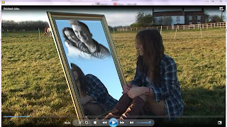 To convey the theme of love to the utmost in the video, I have directly related certain shots in correspondence with the emotional lyrics of the song. An example of this is during the opening sequence, a long shot of the artist looking into the mirror, directly linking with the lyrics “is the face in the mirror looking back at you”. This long
reflective shot makes direct to the audience the artists view of their relationship and the happy memories she shared with him. This technical shot is an
important feature of the video as it introduces associations of the narrative
to the audience. In creating this effect I had to super-impose a JPEG image as an additional layer on the clip after editing the image on Photoshop. Its fair the say the process was very complicated. (The technical process of creating this effect is linked to the hyperlink above) I also altered the timing of the decrease in saturation of the clip itself, making the image turn black and white half way through the clip. The change into black and white has connotations of memories and the past therefore making clear the image of the couple is a flashback. The inclusion of the mirror adds to the connotation as the self reflective purpose of the prop indicates the image is the artists imagination of reflecting on the past.
To convey the theme of love to the utmost in the video, I have directly related certain shots in correspondence with the emotional lyrics of the song. An example of this is during the opening sequence, a long shot of the artist looking into the mirror, directly linking with the lyrics “is the face in the mirror looking back at you”. This long
reflective shot makes direct to the audience the artists view of their relationship and the happy memories she shared with him. This technical shot is an
important feature of the video as it introduces associations of the narrative
to the audience. In creating this effect I had to super-impose a JPEG image as an additional layer on the clip after editing the image on Photoshop. Its fair the say the process was very complicated. (The technical process of creating this effect is linked to the hyperlink above) I also altered the timing of the decrease in saturation of the clip itself, making the image turn black and white half way through the clip. The change into black and white has connotations of memories and the past therefore making clear the image of the couple is a flashback. The inclusion of the mirror adds to the connotation as the self reflective purpose of the prop indicates the image is the artists imagination of reflecting on the past.
 To convey the theme of love to the utmost in the video, I have directly related certain shots in correspondence with the emotional lyrics of the song. An example of this is during the opening sequence, a long shot of the artist looking into the mirror, directly linking with the lyrics “is the face in the mirror looking back at you”. This long
reflective shot makes direct to the audience the artists view of their relationship and the happy memories she shared with him. This technical shot is an
important feature of the video as it introduces associations of the narrative
to the audience. In creating this effect I had to super-impose a JPEG image as an additional layer on the clip after editing the image on Photoshop. Its fair the say the process was very complicated. (The technical process of creating this effect is linked to the hyperlink above) I also altered the timing of the decrease in saturation of the clip itself, making the image turn black and white half way through the clip. The change into black and white has connotations of memories and the past therefore making clear the image of the couple is a flashback. The inclusion of the mirror adds to the connotation as the self reflective purpose of the prop indicates the image is the artists imagination of reflecting on the past.
To convey the theme of love to the utmost in the video, I have directly related certain shots in correspondence with the emotional lyrics of the song. An example of this is during the opening sequence, a long shot of the artist looking into the mirror, directly linking with the lyrics “is the face in the mirror looking back at you”. This long
reflective shot makes direct to the audience the artists view of their relationship and the happy memories she shared with him. This technical shot is an
important feature of the video as it introduces associations of the narrative
to the audience. In creating this effect I had to super-impose a JPEG image as an additional layer on the clip after editing the image on Photoshop. Its fair the say the process was very complicated. (The technical process of creating this effect is linked to the hyperlink above) I also altered the timing of the decrease in saturation of the clip itself, making the image turn black and white half way through the clip. The change into black and white has connotations of memories and the past therefore making clear the image of the couple is a flashback. The inclusion of the mirror adds to the connotation as the self reflective purpose of the prop indicates the image is the artists imagination of reflecting on the past. 
 A range of sequences
to pose as flashbacks have been used in the video which specifically dominate the screen. This meant I had to think of a way to ensure the audience understood the different clips in the video which posed as either the performance or narrative. I followed the expected convention of using continuous cross cutting to create this idea. In reinforcing this, I focused on two domiant locations which the cross cutting would mainly reverse between. Firstly the performance form which existed in the wood location with the artist wearing a specific flowery dress. And secondly the narrative form which took place in the barn location involving both the male and female model. I also used an extreme close up shot of the artist closing her eyes which contributes to the lexis of dreams, flashbacks and imagination. I adopted the idea of using flashbacks from the music video Beyonce – Halo. In making the flashbacks distinctive to the country genre, I developed the concept by altering the features of a conventional dream. I expectadly lowered the saturation levels on each narrative shot to create the black and white
effect. But uniquely, on shots of specific importance to the narrative, I also incorporated a "Matrox Mask", which provided many different choices as to the effect to be place around the edge of the shot. I chose "Soft Dream" which as named, fits the purpose well. By altering the levels I made this blur less prominent as if to resemble a memory or dream. I specifically used this effect on the sequence when the male model gives the artist a neclace to show his love and appreciation of her. Action shots such as this, link the key theme of love with
the country genre. The established focus on the narrative is very important in
promoting the genre of the music video, the incorporated product adds further
entertainment for my target audience who made clear from polls on my blog,
liked the concept of a music video focused on love.
A range of sequences
to pose as flashbacks have been used in the video which specifically dominate the screen. This meant I had to think of a way to ensure the audience understood the different clips in the video which posed as either the performance or narrative. I followed the expected convention of using continuous cross cutting to create this idea. In reinforcing this, I focused on two domiant locations which the cross cutting would mainly reverse between. Firstly the performance form which existed in the wood location with the artist wearing a specific flowery dress. And secondly the narrative form which took place in the barn location involving both the male and female model. I also used an extreme close up shot of the artist closing her eyes which contributes to the lexis of dreams, flashbacks and imagination. I adopted the idea of using flashbacks from the music video Beyonce – Halo. In making the flashbacks distinctive to the country genre, I developed the concept by altering the features of a conventional dream. I expectadly lowered the saturation levels on each narrative shot to create the black and white
effect. But uniquely, on shots of specific importance to the narrative, I also incorporated a "Matrox Mask", which provided many different choices as to the effect to be place around the edge of the shot. I chose "Soft Dream" which as named, fits the purpose well. By altering the levels I made this blur less prominent as if to resemble a memory or dream. I specifically used this effect on the sequence when the male model gives the artist a neclace to show his love and appreciation of her. Action shots such as this, link the key theme of love with
the country genre. The established focus on the narrative is very important in
promoting the genre of the music video, the incorporated product adds further
entertainment for my target audience who made clear from polls on my blog,
liked the concept of a music video focused on love.
My music video again uses the correct conventions of a music video through inclusion of the key areas of performance. Thus, ensuring the artist is continuously promoting the track and her performance attributes to the audience, the purpose of the music video. In capturing the artists performance I have used a range of camera shots and
movements. These range from extreme long close up shots with included features such as zoom, panning shots, circular handheld shots, high angle shots ect. It could be argued the non frequent change of camera techniques actually challenges the generic conventions of a music video. My personal camera skills are quite simplistic which can be seen in areas of the music video such as the camera shake in the long shot of the artist walking around the tree. If given the task again, I would explore the different techniques of filming to widen my knowledge. Also I would choose a location which had a flat surface as the wooded location was on a hill making it even more difficult to create movement shots. In attempt to improve my video and make these factors less recognisable, I put the model in alternate positions to add change and keep the camera still. Examples involve: making the model sit on the tree, high angle shots and extreme close up shots ect.
 To
reinforce the narrative of the music video through the performance, I have exaggerated the models singing in certain situations. For example, the long shot of the artist leaning against the
hay bale. The timing of this shot to occur directly after the flashback of the couple messing around in the hay, suggests the artist is reminiscing on the past. Apart from this singular shot, the majority of the performance exists in the wooded location, inspiration
from music videos by the artist Birdy
whose videos connote a natural beauty and simplicity. The darker tone of shots
in the wooded location such as the close up of the model singing “not his price
to pay” connote a possible darker nature of the artists personality and the
physical pain she is feeling from reflecting on her previous relationship. The
nature of the wood location also reflects the continuous progression of life
and the concept of Mother Nature
indicating to the audience (in terms of the narrative) that life for the artist
will continue even though she has suffered through her heartbreak. Also the recognition of this concept adds to the natural purity of the use of the locations in the video adding the tone of beauty and simplicity to my video, as stated I wanted to achieve from my research into influential media texts.
To
reinforce the narrative of the music video through the performance, I have exaggerated the models singing in certain situations. For example, the long shot of the artist leaning against the
hay bale. The timing of this shot to occur directly after the flashback of the couple messing around in the hay, suggests the artist is reminiscing on the past. Apart from this singular shot, the majority of the performance exists in the wooded location, inspiration
from music videos by the artist Birdy
whose videos connote a natural beauty and simplicity. The darker tone of shots
in the wooded location such as the close up of the model singing “not his price
to pay” connote a possible darker nature of the artists personality and the
physical pain she is feeling from reflecting on her previous relationship. The
nature of the wood location also reflects the continuous progression of life
and the concept of Mother Nature
indicating to the audience (in terms of the narrative) that life for the artist
will continue even though she has suffered through her heartbreak. Also the recognition of this concept adds to the natural purity of the use of the locations in the video adding the tone of beauty and simplicity to my video, as stated I wanted to achieve from my research into influential media texts.
Appropriate mise-en-scene is specifically conventional of the
country genre. The alternate costume, location and props make's the country genre very distinct. For shots in the barn location involving flashbacks, both the
models are wearing shirts traditionally worn on working farms. Casual jeans
with wellington boots for footwear also contribute to the traditional outfits worn in the countryside. As part of the models costume, I have purposely chose pink and blue shirts accordingly to represent their gender and stereotypes. As the outfits are historically worn on working farms in the countryside, a casual tone is represented, adding to the realism of the narrative. The chosen barn
location reinforces the costume choice of the models as hay bales and fields
are iconic of farm land and the country.


 In total I had three costume changes for the
artist using four different locations. The performance of the artist is very
dominant in the music video therefore the costume had to be very appropriate to
the country genre. I chose to feature the artist wearing a long flowery dress
with brown knee high boots. The costume relates really well with the country
genre as it matches the theme of natural environments, specifically the wood
location. The float like structure of the dress created nice effects in certain
shots, for example when the wind blew onto the dress it signified the idea of
natural beauty. It is this costume choice which also features in the ancillary
texts.
In total I had three costume changes for the
artist using four different locations. The performance of the artist is very
dominant in the music video therefore the costume had to be very appropriate to
the country genre. I chose to feature the artist wearing a long flowery dress
with brown knee high boots. The costume relates really well with the country
genre as it matches the theme of natural environments, specifically the wood
location. The float like structure of the dress created nice effects in certain
shots, for example when the wind blew onto the dress it signified the idea of
natural beauty. It is this costume choice which also features in the ancillary
texts.
To widen the audience market, I attempted to also
target elements of the pop genre, creating a bricolage. In doing this I advanced
the lyrical convention of a music video by emphasising the words of the song
through the artist’s actions. I also heightened the emotional intensity of the
lyrics by continuing a narrative throughout the video. Close up shots of the
artist performing promotes the emotion she is feeling as her facial expressions
are made very clear. Also the inclusion of low angle shots in the video
connotes her vulnerability in the dominating location of the wood which
reflects how the artist feels in her current situation of heartbreak. Even the
use of shot transitions when editing the music video have been used to reflect
the artist’s mood. The continuous use of “Fade to black” connotes the
increasing depressing mood of the artist as she further reflects on her past
throughout the song.
By exaggerating the emotional meaning of the
lyrics, certain shots have lasted for a longer amount of time than
conventional. However, the long notes of the song itself have meant these
longer lasting shots are actually suited the tone of the video. Examples of
this exist more so in the performance areas of the video where the artist
emphasises the lyrics of the song. Although not generically conventional, it
does stress the deep meaning of heartbreak the artist is trying to convey to
the audience. This is another attribute of the video which makes it distinctly
follow the country genre.
I organised five seperate production plans of filming footage for my music video:
 A major factor I had to consider before filming was the prediction of the weather conditions. In accordance with the conventions of the country genre, the weather should be sunny and bright creating a happy and lively atmosphere. However this completely contrasted the depressing mood I wanted to convey from the emotional narrative. I used the weather to reflect the mood of the artist in different situations. Evidentially, this was very risky as on occasions the weather turned out different to what the BBC website predicted.
  The snap shot featuring both the male model and the artist is intended to have a sunny and bright sky connoting the happiness the artist felt with her previous partner. The positive lighting is a reflection of the artist's feelings. The following, downward panning shot then shows the artist stood by herself crying, showing her emotional and upset mood when reminiscing on the past. The change in weather conditions to clouds connotes the confusion and distress of the artist when reflecting on the past.
CONVENTIONAL ANALYSIS OF MY ANCILLARY TEXTS CAN BE VIEWED UNDER THE HEADING "HOW EFFECTIVE IS THE COMBINATION OF MY MAIN PRODUCT AND ANCILLARY TEXTS"
How effective is the combination of my main product and ancillary texts?
I have created a Go Animate presentation in order
to analyse how effective the combination is of my main product and ancillary
texts. Key aspects of the similarities between the video and digipak/poster
are recognised in the presentation. An example being the use of black and white
to continuously set atmosphere of the depressing mood the artist has from her
heartbreak. This directly links with the use of flashbacks throughout the music
video to emphasise the key theme of love. Other important factors are mentioned
in the digipak such as the means of promotion of the package, the reflection of
the country genre through mise-en-scene and the continuous theme of heartbreak.
Animated Presentations - Powered by GoAnimate.
- When creating my ancillary texts I took photographs following the same mise-en-scene as my music video to mainly concentrate on promoting this specific track. I felt it was important physically take photographs of my model in the various locations instead of just print screening images from the editing suite. This ensured the content of the photographs in my ancillary texts had a high quality.
- Also I was able draft different ideas by taking photographs of the model in various poses, not shown in the video itself.
- I wanted to continue a similar theme throughout the different areas of my ancillary text to collectively make the product easily identifiable to the audience. In creating synergy between the video and ancillary texts I added similar features to both products such as the black and white effect connotong a negative tone, reflecting the attitude of the artist. The main colour scheme of black and white also reinforces the concept of looking into the past which is a dominant feature of my music video.
- As part of the synergy, I also continued the use of the font face “Vladmir Script” as an expression of the country genre. Although contrasting in tone to the negative atmosphere of the artist, I also included a star effect to reinforce the focus of the ancillary text, to promote the artist as a star herself.

For the front cover I used a distinctive long shot of the model sat on a fallen tree in the wooded location. The front cover is iconic of the album release; I ensured it directly relates to the attached music video by using the same performance costume and location. The busy background of the photograph meant originally, the text did not stand out. I found a solution using the programme Photoshop- to select the surface area of the model using the Polygon tool, select the option “inverse” and then use “Guassian Blur” to give the background a slight blur. Then I simply altered the order of the layers to make the text dominant. For the text itself promoting the artists name, I used the colour white to signify the innocence of the artist through her pain of the heartbreak she suffered.
The back cover of the digipak immediately connotes her vulnerability to the audience from the high angle shot. Arguably this is not conventional as it does not promote the artist as dominant. However the continuous tone of the music video must be reflected through the digipak and in this track the artist is feeling vulnerable and upset. The raw emotion promoted through both the music video and the digipak targets the audience better as it makes the audience feel they can relate with the theme of heartbreak and really understand the lyrical importance of the song. The connotations of the font face and colour have been repeated onto the back cover as continuity. I included all legal information on the bottom third of the page in a small print to keep the text subtle against the main advertisement of the different song titles of the album. I incorporated the record label “Warner Bros” as this global company has the ability to promote my album all over the world. I also included a barcode in its conventional placing.
In addition to the digipak I have created two separate CDs to be placed inside the album. Existing CDs are very simplistic with a minimal design following the specific genre. Using Photoshop I cropped the artist’s eyes from a close up image, and then simply altered the saturation making the image black and white. This effect allows the audience to make a connection with the album as direct eye contact is made. In following the expected conventions, I have also included the name of the artist and the name of the album on the front of the CD, again using the same text appearance continuing the house style. In continuing the idea of purity and nature I have used photographs of areas of the wood location to be placed under the CD itself. The continuity of this theme is fundamental to both the digipak and music video as it represents the county genre. Another included feature in promoting this genre is the two black and white photos included adding narrative to the digipak itself. The use of the medium shot of the artist gazing out onto the field represents her self reflecting persona and her journey ahead. This shot connotes a tranquil image from the use of natural background the artist’s hair casually blowing in the wind. The other black and white image, the establishing shot, mainly has the purpose of reinforcing the country genre as the image represents a traditional working farm.


I have also created a magazine advertisement to promote both the digipak
and music promo video. I constructed this piece using Adobe Photoshop. Firstly
I found the appropriate measurements for my poster using the following website. I created a dark, circular blur around
the outside of my poster by changing the features of the brush tool. I then
basically changed the opacity and carefully selected the outside area I wanted
darken. This effect puts emphasis onto the artist making her centre of the
image. Also it draws attention to the bright, surroundings behind the model
connoting the journey she must face in order to move forward from her
heartbreak. This directly relates with the continued theme throughout the music
video of the artists heartbreak and the following choices she must make. I
chose to continue the text format as part of house style onto my magazine
poster using "Vladmir Script". This continuously reinforces the femininity
of the combined package. To make the quote at the bottom of the page stand out
I have used the same text format but changed the colour to white. Again this
continues the theme of black and white dominantly used throughout the digipak
and music video. The text includes:
"'Natural Perfection' as quoted by Q magazine
Limited Deluxe Edition"
Q
magazine is a huge magazine promotion institution which would definitely
advertise my product well. The use of the quote reinforces the institution'
acceptance and opinion of the music video and ancillary texts as well. Also the
use of "limited" is meant to entice the audience and make them feel
more eager to buy the album.
What have you learned from your audience feedback?
During the research stages of my advanced portfolio, I investigated possible influential media texts which related to my chosen song and gained valuable audience feedback. Here are the three videos I created for audience feedback: (extra information about the videos can be found on my blog on the post "Audience feedback from influential media texts")
Influential Media Texts - Audience Responses!
Influential Media Texts - Audience Responses!
=
I followed the collective response from the audience
feedback videos by using locations which made clear the influence of natural
beauty in my video. I have used three dominant locations throughout my music
video; the barn, the wood and the field. The wood and field location especially
connotes this natural beauty and directly relate to the country genre. The feedback
also claimed the result of the narrative did not need a specific ending. The
narrative of my music video focussed on the concept of love from the use of
flash backs by the artist when looking into the past. The emotional intensity
the artist portrays is made clear therefore relatable on some levels with the
story of Romeo and Juliet which also features the dominant theme of love.
Looking back at the audience responses prior to the construction of my music
video, I am very happy with the outcome and felt I have met much of the
criteria specified by my target audience.
Poll Results
At the start of my advanced portfolio I also conducted some polls to establish members of my target audience. This helped influence certain decision during the construction of my music video, as obviously I needed to meet the criteria.


 ·
Unexpectedly,
my polls have indicated that I have a 50% equal male and female target audience.
As made clear from my reader profile, I attempted to target a dominant female
market. I still feel the music video targets more of female market than male,
however this assumption is only made from gender stereotypes and idea that
males would not enjoy a video based on the theme of love.
·
Unexpectedly,
my polls have indicated that I have a 50% equal male and female target audience.
As made clear from my reader profile, I attempted to target a dominant female
market. I still feel the music video targets more of female market than male,
however this assumption is only made from gender stereotypes and idea that
males would not enjoy a video based on the theme of love.
· As made clear, I have established
both a narrative and performance form which complement each other through the
theme of love in my music video. The polls indicated that 87% of my audience
preferred a consistent narrative form which I have abode by through my video.
The dominant narrative aspect adds entertainment and suspense to the music
video as the audience become keen to watch and find out the conclusion of the
story.
· In terms of the poll "which
emotions do you like to be conveyed through my music video?" I have
followed the advice of the majority suggesting love/romance should be featured
(75%) The other responses where quite varied therefore I have attempted to incorporate
many different emotions in the video through the narrative. Love and happiness
is posed through the artist’s flashbacks of the relationship, also elements of
anger and upset and clear from the performance of the artist and the emotions
of heartbreak she is feeling.
- Name three things you liked about the music video?
- What aspect of the video would you improve?
- Does the mise-en-scene reflect the country genre?
- Can you understand the continued theme of heartbreak through the use of flashbacks?
- Do you find the combination of my music video and ancillary texts effective?
- What specifically did you like about the poster and digipak?
- Does the dark lighting connote her depressed mood?
- Any major improvements you would make?
As previously mentioned, I
uploaded my completed music video onto the digital format YouTube. This was
both useful to gain an embedded HTML code to paste onto my blog, and gain a
wide amount of audience feedback. Here is a snap shot of some of the feedback I
have received from members of my target audience from the comments on YouTube.
As an additional feature, YouTube also counts the total number of views the
video has received since being uploaded. This is very useful for analysing the
popularity of the video.


How did you use new media technologies in the construction, research, planning and evaluation stages?
- Word Count: 4362
(Excluding Prezi' and Go animate presentations)
Friday 22 March 2013


Tuesday 19 March 2013


Digipak Construction Process

I chose
to change the layout format of the digipak to include a circular CD shape
giving me an accurate template to work on. I found this on the same website as
I previously used. So far, in terms of the construction of my template, I have
included the front and back cover.
To create the featured wooded
shots to be placed behind the CD, I used the crop tool on a selected area of a photograph
using the programme Photoshop. I then used the transform tool to adapt the size
of my image to fit the template.

For the image on the inside left cover of the digipak, I want
to include a simplistic location shot suiting the country genre. However the
bright and sunny tone of the unedited picture did not suit the mood of the
digipak. Which should in fact represent the personal heartbreak of the model? I
experimented changing the levels on the image, reducing the saturation makes
the image black and white.

I then attempted using the opposite effect to black and white by greatly increasing the levels and curves making the image brighter. I do not like this effect as much as the black and white.

After making the choice to use the location shot in black and white, I selected and transformed the photograph to fit it in with the layout structure of the digipak. I now have a foundation construction of the creation of the digipak to be improved upon.
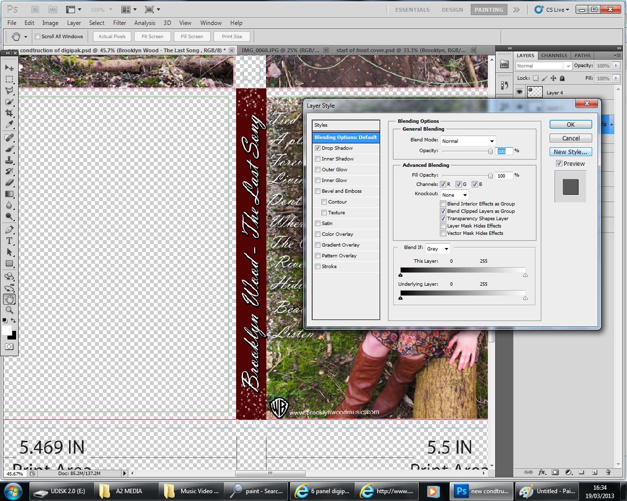
To continue the house style throughout my digipak, I decided to use the same font as the rest of the text on the fold line. I then, again used drop shadow on blending options to enhance the boldness of the text.

I also used the brush tool "sparkles" to continue the effect throughout my digipak. The brush stroke stands out really well against the burgundy box colour.

I then began to work on the CDs themselves. I wanted to continue the use of black and white to make sure all aspects of the digipak linked with each other. I used a photograph from my photo shoot and used the crop tool to select just the eyes. I then changed the saturation alike my previous image to create a black and white effect.

I now had to find a way of fitting the eyes onto the CD template. In my first attempt, I used the polygon lasso tool to cut round the edge of the image on the template. Then I used the blur tool to make the edges even.
Subscribe to:
Posts (Atom)